
Clever Architecture is excited to announce they have completed designs for their newest Restaurant: Thai Spicy. Our knowledge of the local Saint Paul market, quick understanding of our client's needs, decisive design approach, combined with our fast turn around made us the perfect choice to design the restaurant. Look for it coming this spring in the Hmongtown Marketplace at the corner of Como and Marion in Saint Paul. Also, look for new Marketplace enhancements designed by Clever's Marcia Stemwedel.
One of Clever Architecture's greatest features is our depth of restaurant and food service design. Jeff, Marcia and Russ have designed numerous successful prototypes, individual haunts and brands including multiple Caribou Coffee locations across the country, Life Cafe, Amoos Artisan Ice Cream, Bellingham Mall Food Court, Sawan Marketplace, O'Garas, Paradies Marketplace, Studio Distilling and the hottest new speakeasy Volstead's Emporium.
25 Comments
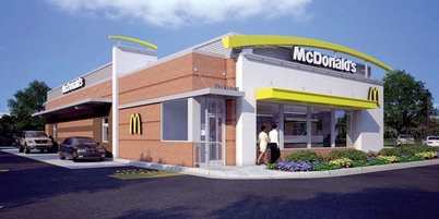
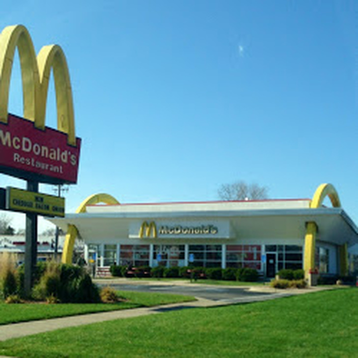
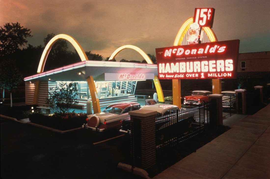 McDonald's has been in the news recently for a dramatic sales drop. According to Forbes, net income is down by nearly 30%. United States sales alone are down more than 4%. McDonald's has been plagued by a number of issues world wide including health scares in China and Russia as well as competition from fast casual "healthier" restaurants in the United States. Several sources have cited McDonald's burgeoning menu as the biggest problem. Some might say that it bit off more than it could chew. But from a retail designer's standpoint the biggest issue of all is that McDonald's is having an identity crisis as originally mentioned in The Economist from January 2015. As McDonald's expanded globally they started making local adaptations, which for the most part is a good idea. Brands around the world do that frequently with great success. Everything is local. But in order to fend off competition from the likes of Starbucks and Chipotle, McDonald's entered an era of redesigning all of its restaurants. It developed a new, more European approach it branded McCafe. Then it imported those design features into its American regular McDonald's restaurants. An article in Lab Brand from 2011 sheds some light, "According to French designer Philippe Avanzi, the newly designed spaces are trying to enhance customer experience and attract a younger crowd... In order to reach out to them, McDonald’s has decided to change the original design of stores. The first step in their design strategy was dropping the 'clownish' red that for so many years has been the key element of McDonald’s interior and exterior decoration. This red has now been replaced with more subtle colors, such as light oranges and greens. Another change has been the upgrading of the chairs from industrial steel to wooden and more colorful stools. In some cases, leather chairs have been used..." Attracting and retaining a younger crowd is good, but they forgot one thing. The McDonald's theory was always "get them when they are young and you will retain them for life." So it pushed out the young kids (the red, iconic shape, the clown, the playland) in favor of the young adult millenials (streamlined, hipster colors, european cafe, wifi). The result is a suburban, non descript retail box with a yellow swoosh and an upscale hospital cafeteria inside. (See new design samples below.)
Additionally, they made regional changes from one landscape to another resulting in a cacophony of designs that have removed it from an iconic brand. Here are two screenshots from searches of McDonald's images: exteriors and interiors 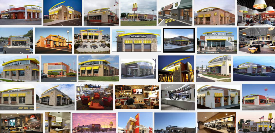 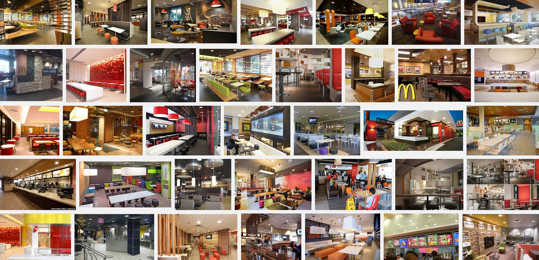 Can you make out the brand? I'm not sure the public can. Now imagine this approach being applied across all areas of the restaurant, food, service, quality control, uniforms, signage... I think you can see where this is leading. It isn't just that the menu got to big and out of control, so did the rest of the restaurant. And it started with the idea that they needed to attract hipster millenials on a regional basis to boost sales. Obviously, it didn't work.
By Russell Peterson Russell Peterson | ALA CID is an architect, interior designer, blogger and founder of Clever Architecture in Minnesota. He has designed a number of prototype projects for iconic brands including Life Time Fitness and Vision World. He can be reached at russ@cleverarchitecture.com. Photos assumed in the public domain unless otherwise notified. 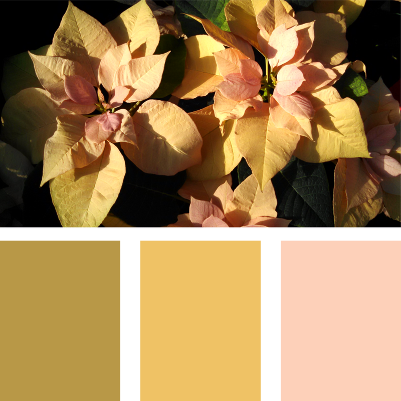 Photo | Poinsetta With Winter Colors | Russell Peterson As we begin a new year, drawing inspiration from the natural world around us is an important push forward. Trends in color seem to come and go so quickly, but there are some things just so beautiful they will remain a constant companion.
|
Clever ArchitectureConcepts, designs, and trends in the worlds of architecture, interiors, and planning by Clever Architecture and friends. Archives
September 2021
Categories
All
Blog Roll99U
Agincourt A Daily Dose of Architecture A | N Blog ALA Blog ArchDaily ARCHITECT Magazine Architect's Journal Architectural Record Architizer Building Building Design + Construction Building Green City of Sound City Lab Co.Design Contract Magazine Curbed Design Observer DesignIntelligence Dezeen Dwell GOOD Green Building & Design House Beautiful Inhabitat Inspired Room Interior Design LearnStuff Life of an Architect MAS Context Metropolis P/O/V Neighbourhoods Planetizen Public Interest Design Retail Design Blog Retail Square SmartPlanet Transmaterial Treehugger Trim Tab Living Furniture |

 RSS Feed